7 VIsUaLiZe Distribution with ggplot2
We will be using build-in data set iris.
| Sepal.Length | Sepal.Width | Petal.Length | Petal.Width | Species |
|---|---|---|---|---|
| 5.1 | 3.5 | 1.4 | 0.2 | setosa |
| 4.9 | 3.0 | 1.4 | 0.2 | setosa |
| 4.7 | 3.2 | 1.3 | 0.2 | setosa |
| 4.6 | 3.1 | 1.5 | 0.2 | setosa |
| 5.0 | 3.6 | 1.4 | 0.2 | setosa |
| 5.4 | 3.9 | 1.7 | 0.4 | setosa |
| 4.6 | 3.4 | 1.4 | 0.3 | setosa |
| 5.0 | 3.4 | 1.5 | 0.2 | setosa |
| 4.4 | 2.9 | 1.4 | 0.2 | setosa |
| 4.9 | 3.1 | 1.5 | 0.1 | setosa |
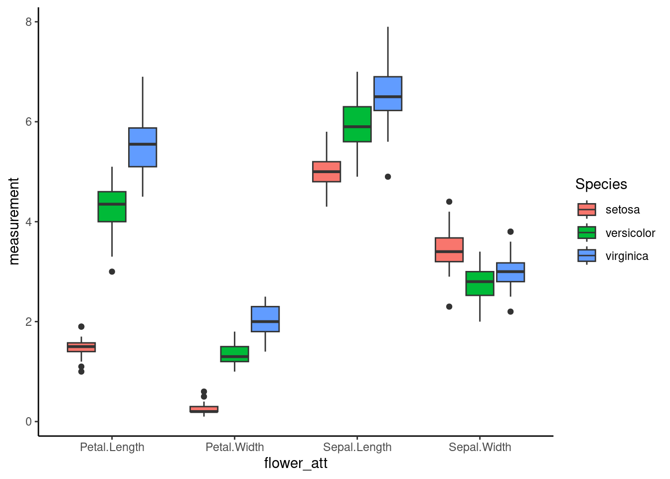
Box plots and its variants requires independent variable(x-axis) to be categorical data. Similar to most datasets, iris requires dataframe transformation to a “long form” such that we have two columns(key and value) for making the plots. we will be using dplyr::gather to perfom the task.
iris_long <- iris %>% gather(key = "flower_att", value = "measurement",
                Sepal.Length, Sepal.Width, Petal.Length, Petal.Width)

iris_long %>% head(10) %>% knitr::kable()| Species | flower_att | measurement |
|---|---|---|
| setosa | Sepal.Length | 5.1 |
| setosa | Sepal.Length | 4.9 |
| setosa | Sepal.Length | 4.7 |
| setosa | Sepal.Length | 4.6 |
| setosa | Sepal.Length | 5.0 |
| setosa | Sepal.Length | 5.4 |
| setosa | Sepal.Length | 4.6 |
| setosa | Sepal.Length | 5.0 |
| setosa | Sepal.Length | 4.4 |
| setosa | Sepal.Length | 4.9 |
7.2 Violin plot
To align both Violin plot and box plot, it sometimes requires some fine-tuning to align both vionlin plot and boxplot
# position_dodge allows overlapping objects side-to-side
dodge <- position_dodge(width = 1)
ggplot(iris_long, aes(x=flower_att,y=measurement,fill=Species)) +
         geom_violin(width=2.5,position =dodge)+
         geom_boxplot(width=0.1, alpha=0.2,outlier.colour=NA,position =dodge)+
         theme_classic()
## Warning: `position_dodge()` requires non-overlapping x intervals.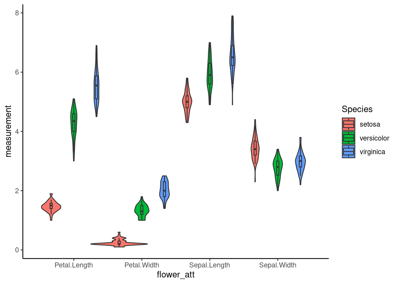
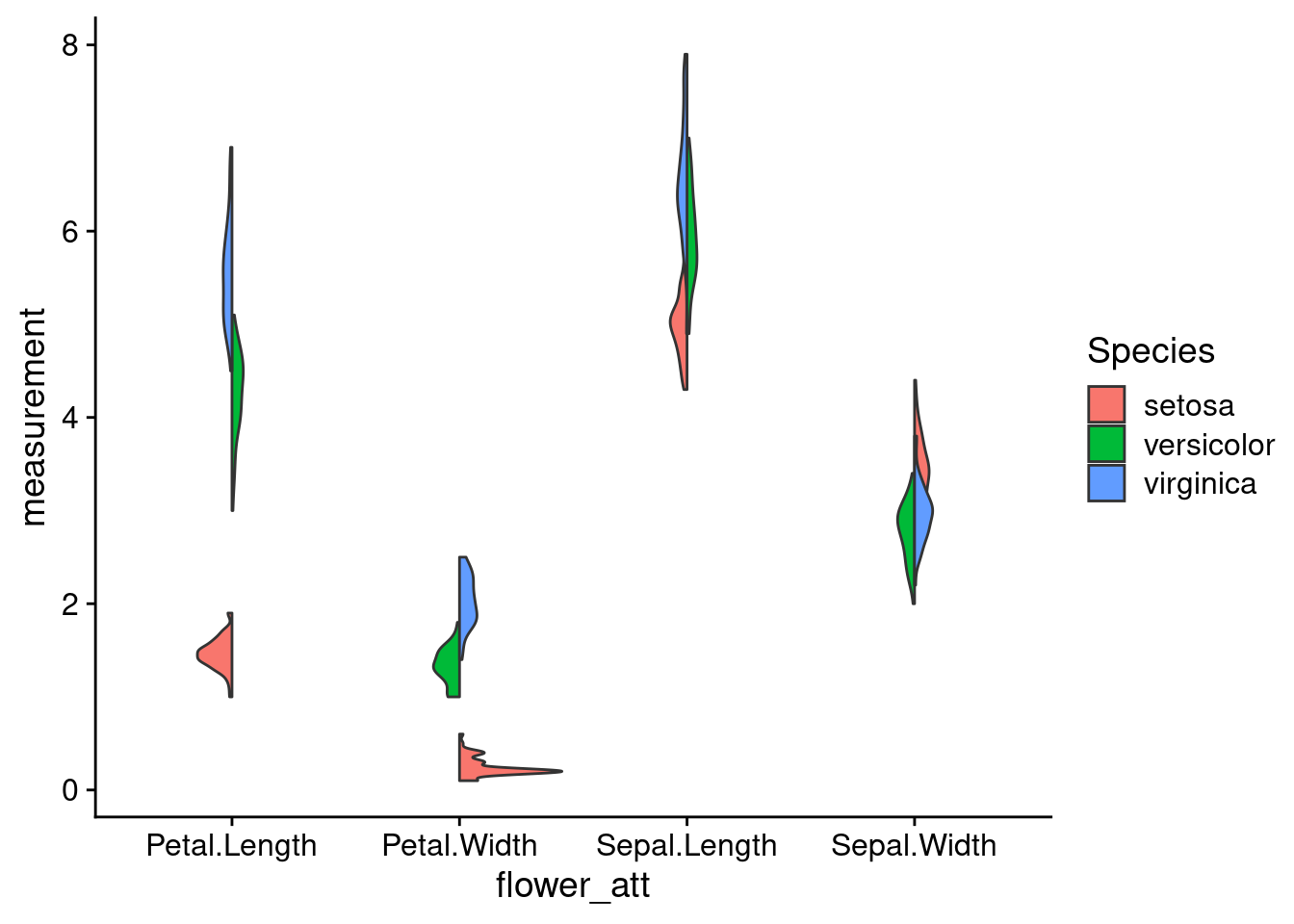
7.2.1 Split Violin Plot
Split violin plots are a particularly useful in providing a direct comparison across categories to observe any overall trends. The function below can be used with ggplot to easily graph a split violin plot.
GeomSplitViolin <- ggproto("GeomSplitViolin", GeomViolin,
                           draw_group = function(self, data, ..., draw_quantiles = NULL) {
                             data <- transform(data, xminv = x - violinwidth * (x - xmin), xmaxv = x + violinwidth * (xmax - x))
                             grp <- data[1, "group"]
                             newdata <- plyr::arrange(transform(data, x = if (grp %% 2 == 1) xminv else xmaxv), if (grp %% 2 == 1) y else -y)
                             newdata <- rbind(newdata[1, ], newdata, newdata[nrow(newdata), ], newdata[1, ])
                             newdata[c(1, nrow(newdata) - 1, nrow(newdata)), "x"] <- round(newdata[1, "x"])

                             if (length(draw_quantiles) > 0 & !scales::zero_range(range(data$y))) {
                               stopifnot(all(draw_quantiles >= 0), all(draw_quantiles <=
                                                                         1))
                               quantiles <- ggplot2:::create_quantile_segment_frame(data, draw_quantiles)
                               aesthetics <- data[rep(1, nrow(quantiles)), setdiff(names(data), c("x", "y")), drop = FALSE]
                               aesthetics$alpha <- rep(1, nrow(quantiles))
                               both <- cbind(quantiles, aesthetics)
                               quantile_grob <- GeomPath$draw_panel(both, ...)
                               ggplot2:::ggname("geom_split_violin", grid::grobTree(GeomPolygon$draw_panel(newdata, ...), quantile_grob))
                             }
                             else {
                               ggplot2:::ggname("geom_split_violin", GeomPolygon$draw_panel(newdata, ...))
                             }
                           })

geom_split_violin <- function(mapping = NULL, data = NULL, stat = "ydensity", position = "identity", ...,
                              draw_quantiles = NULL, trim = TRUE, scale = "area", na.rm = FALSE,
                              show.legend = NA, inherit.aes = TRUE) {
  layer(data = data, mapping = mapping, stat = stat, geom = GeomSplitViolin,
        position = position, show.legend = show.legend, inherit.aes = inherit.aes,
        params = list(trim = trim, scale = scale, draw_quantiles = draw_quantiles, na.rm = na.rm, ...))
}
An example -
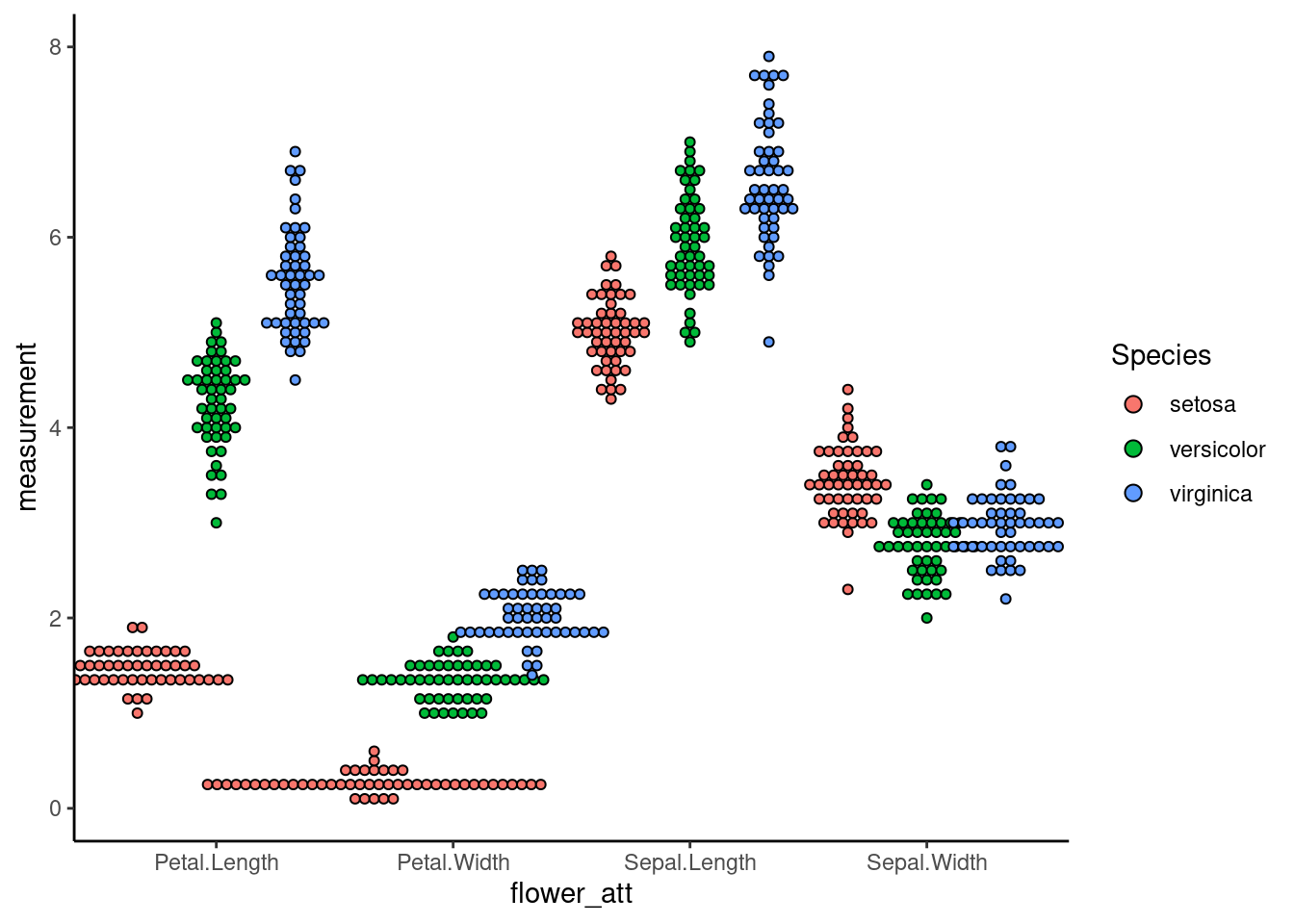
7.3 Dotplot
Sometimes, when the dataset is not normally distributed or having extreme outliners, the density function of violin plot produces strange shapes. In this case, a dotplot is a better alternative
ggplot(iris_long, aes(x=flower_att,y=measurement,fill=Species)) +
         geom_dotplot(binaxis = "y", stackdir = "center",binwidth=1/10)+
         theme_classic()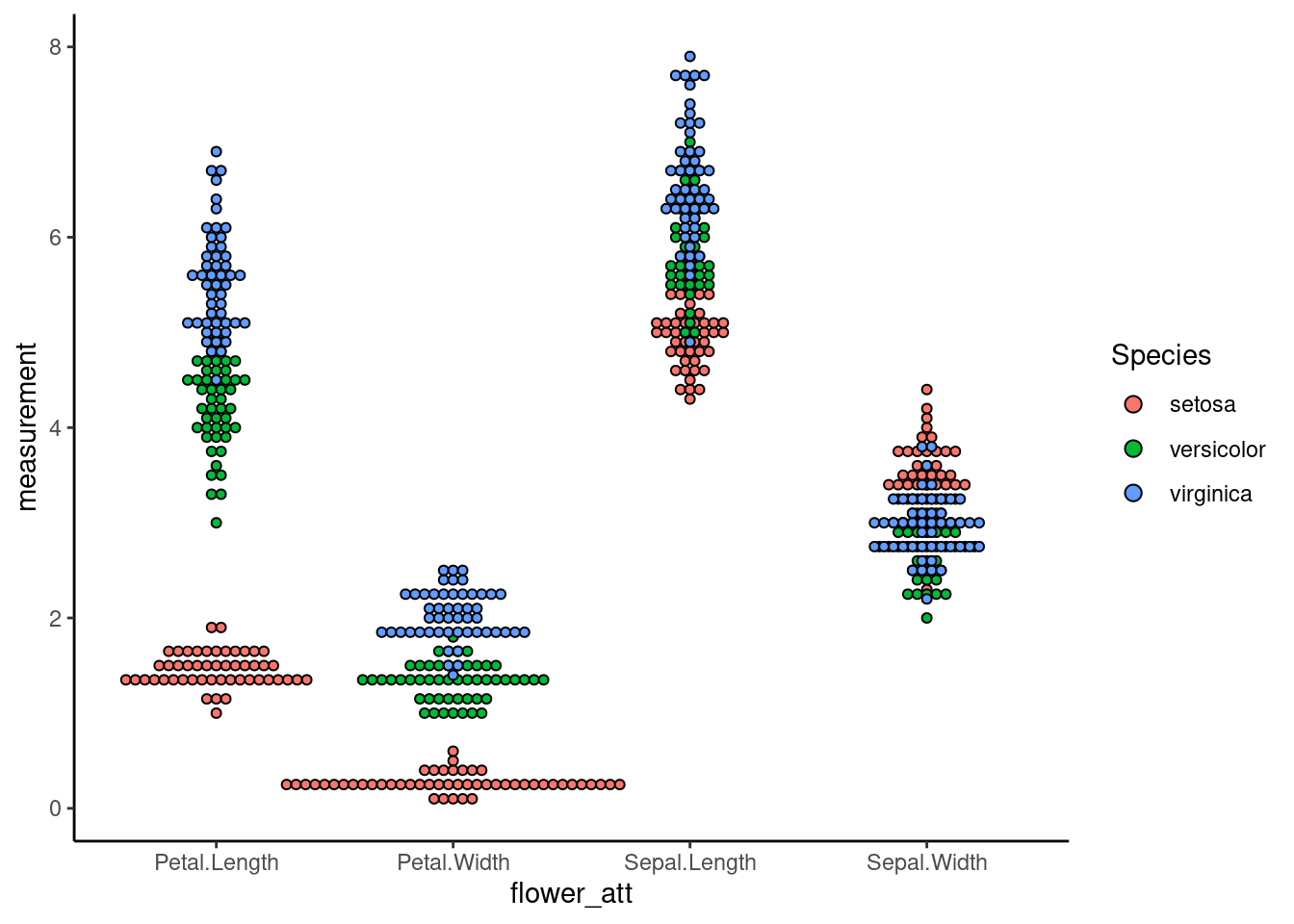
To have an non-overlap dotplot
dodge <- position_dodge(width = 1)
ggplot(iris_long, aes(x=flower_att,y=measurement,fill=Species)) +
         geom_dotplot(binaxis = "y", stackdir = "center",binwidth=1/10, position =dodge)+
         theme_classic()