6 VIsUaLiZe correlations with ggplot2
6.1 Scatter plot
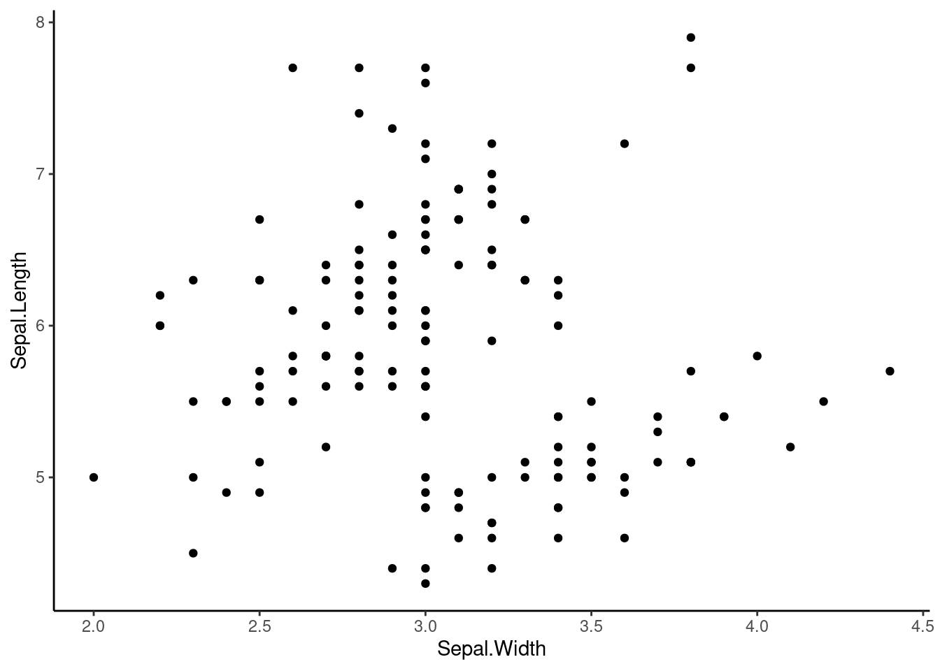
let’s look at width and length of speal
We can add a trend line to the plot. In ggplot, you can use the following variation of geom_line :
geom_vline(): xintercept
geom_hline(): yintercept
geom_abline(): slope and intercept
ggplot(iris, aes(x=Sepal.Width,y=Sepal.Length)) +
  geom_point() +
  geom_hline(yintercept = 5)+
  theme_classic()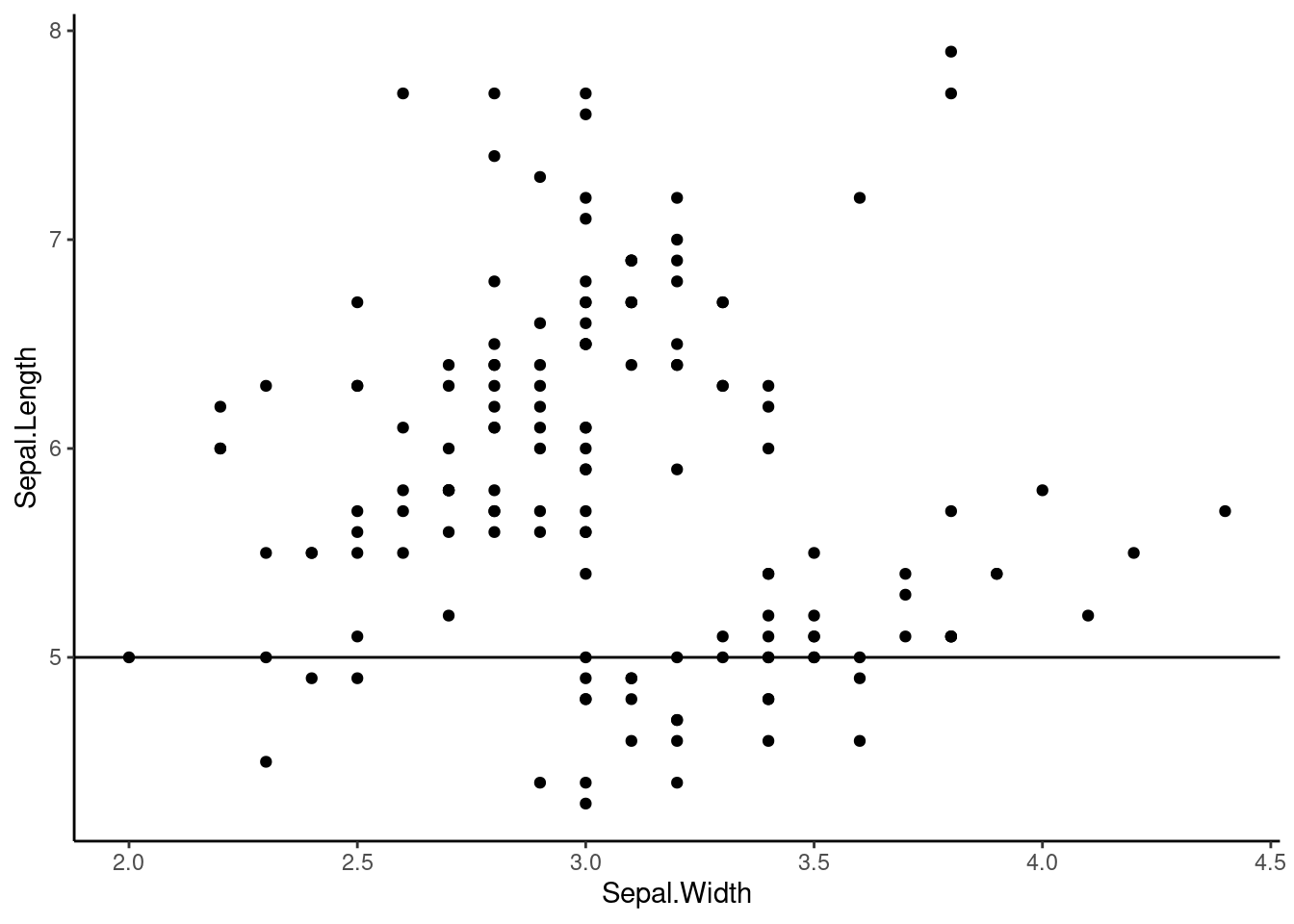
We can add regression model and confidence interval to the plots.
Below, we use linear regression to model width and length of iris speal
  ggplot(iris, aes(x=Sepal.Width,y=Sepal.Length)) +
  geom_point() +
  geom_smooth(method = "lm") +
  theme_classic()
## `geom_smooth()` using formula = 'y ~ x'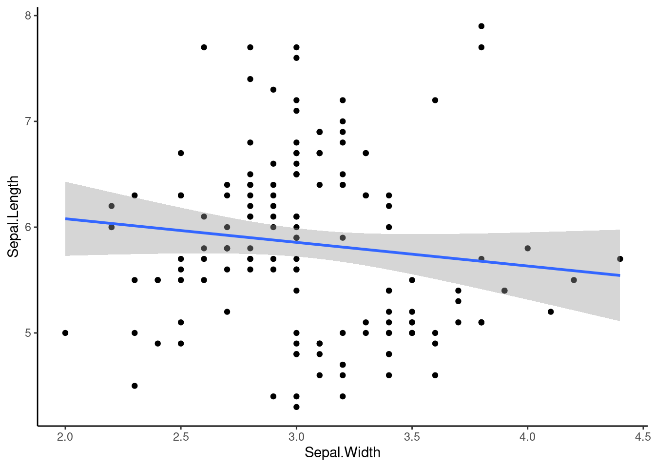
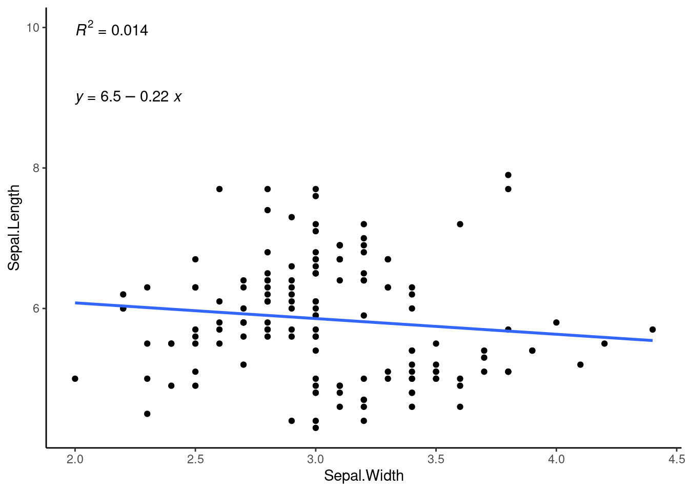
We can use ggpubr package to add R^2 (Coefficient of determination)
library(ggpubr)

  ggplot(iris, aes(x=Sepal.Width,y=Sepal.Length)) +
  geom_point() +
  geom_smooth(method = "lm", se=FALSE) +
  stat_regline_equation(label.y = 9, aes(label=after_stat(eq.label)))+
  stat_regline_equation(label.y = 10, aes(label = after_stat(rr.label))) +
  theme_classic()
## `geom_smooth()` using formula = 'y ~ x'