8 VIsUaLiZe Discrete Data with ggplot2
We will be using build-in ggplot data set diamonds.
| carat | cut | color | clarity | depth | table | price | x | y | z |
|---|---|---|---|---|---|---|---|---|---|
| 0.23 | Ideal | E | SI2 | 61.5 | 55 | 326 | 3.95 | 3.98 | 2.43 |
| 0.21 | Premium | E | SI1 | 59.8 | 61 | 326 | 3.89 | 3.84 | 2.31 |
| 0.23 | Good | E | VS1 | 56.9 | 65 | 327 | 4.05 | 4.07 | 2.31 |
| 0.29 | Premium | I | VS2 | 62.4 | 58 | 334 | 4.20 | 4.23 | 2.63 |
| 0.31 | Good | J | SI2 | 63.3 | 58 | 335 | 4.34 | 4.35 | 2.75 |
| 0.24 | Very Good | J | VVS2 | 62.8 | 57 | 336 | 3.94 | 3.96 | 2.48 |
| 0.24 | Very Good | I | VVS1 | 62.3 | 57 | 336 | 3.95 | 3.98 | 2.47 |
| 0.26 | Very Good | H | SI1 | 61.9 | 55 | 337 | 4.07 | 4.11 | 2.53 |
| 0.22 | Fair | E | VS2 | 65.1 | 61 | 337 | 3.87 | 3.78 | 2.49 |
| 0.23 | Very Good | H | VS1 | 59.4 | 61 | 338 | 4.00 | 4.05 | 2.39 |
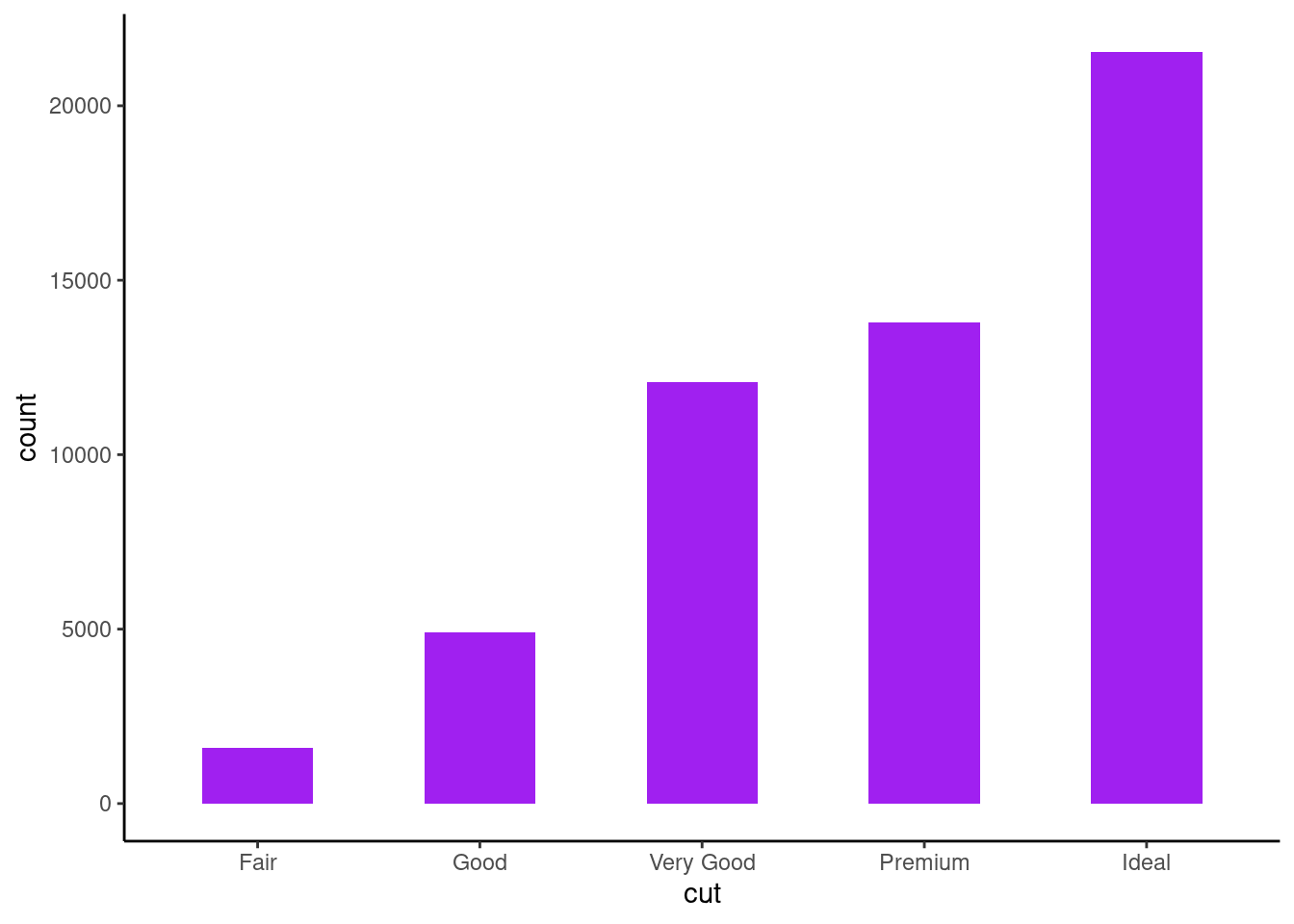
8.1 Bar plots family
ggplot function geom_bar can produce both historgram and bar plot
8.1.1 Histogram
#switch off scientific notation
options(scipen = 10000)

ggplot(diamonds,aes(x=cut))+
  geom_bar()+
  theme_classic()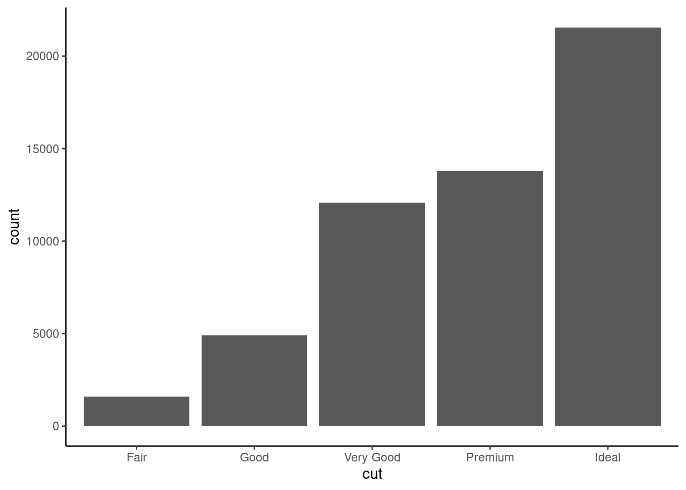
the width and color of the bars can be adjusted as well
8.1.2 Stack Bar plot
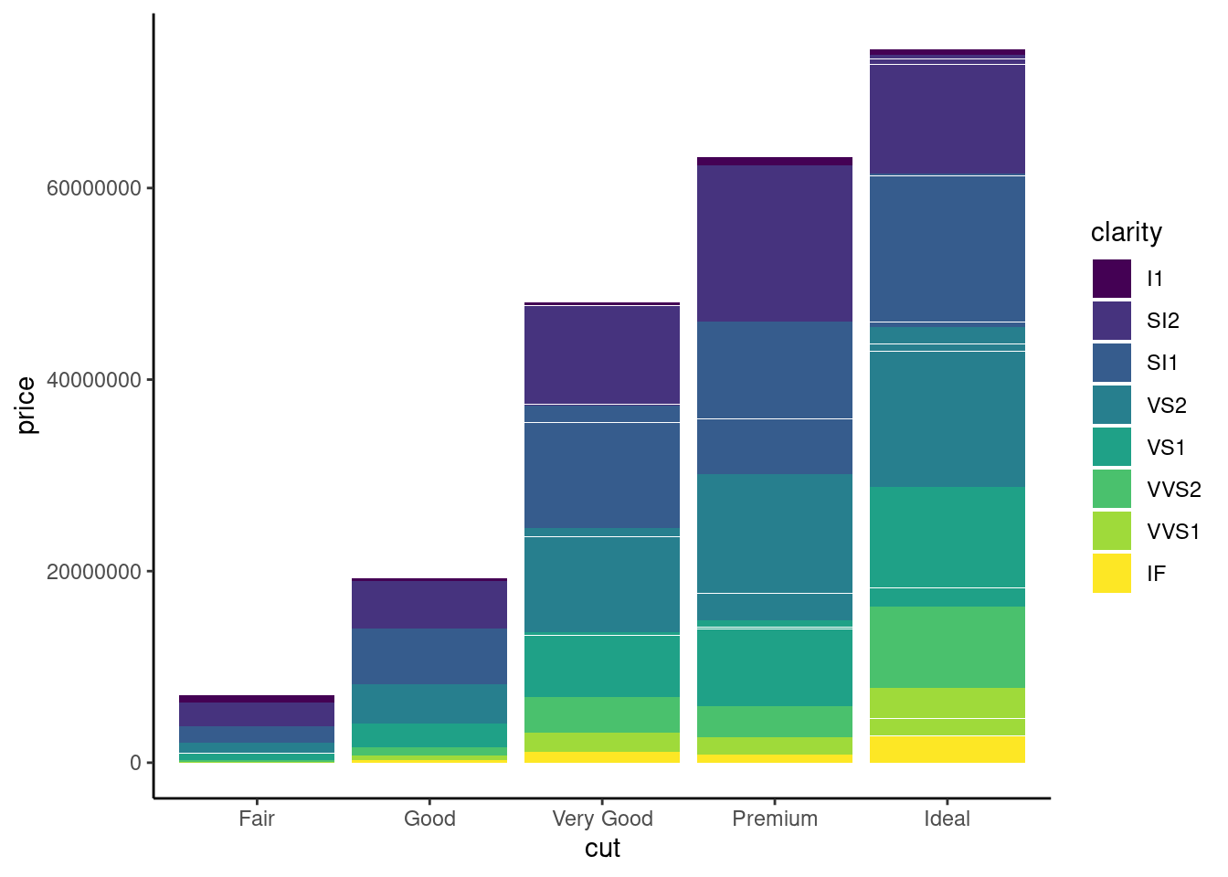
if x-axis is too long , you can flip the plot
ggplot(diamonds,aes(x=cut, y=price ,fill=clarity))+
  geom_bar(stat= "identity")+
theme_classic() +
coord_flip()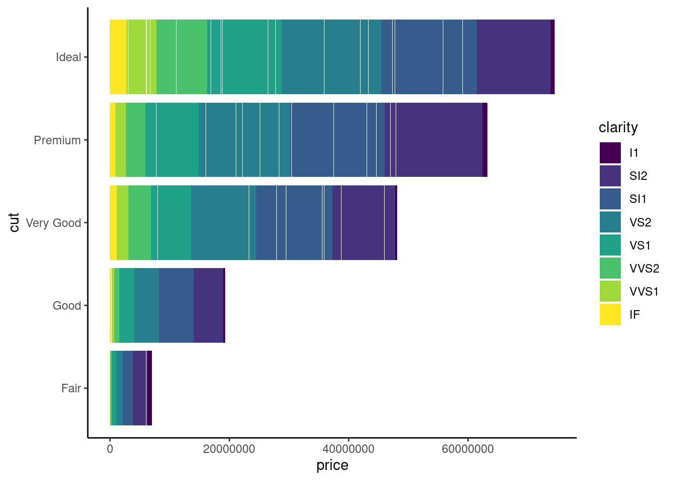
8.1.3 Side-by-Side Bar Plot
ggplot(diamonds,aes(x= clarity, fill= cut))+
  geom_bar(stat= "count", position = 'dodge')+
  theme_classic()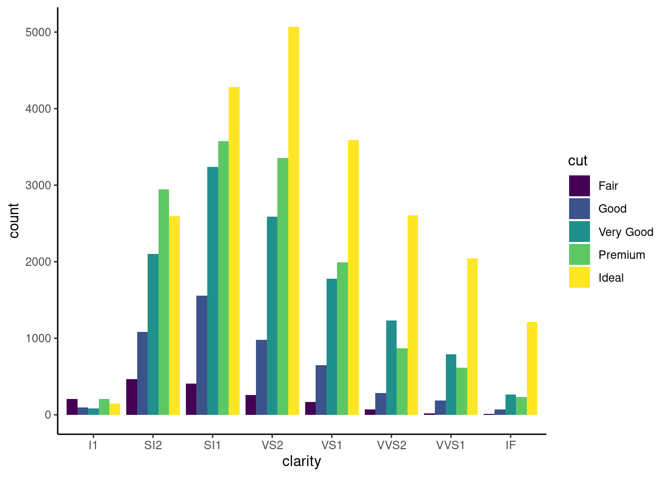
if certain data sets are empty, you can preserve the bar width
diamonds %>%
  filter(!(cut == 'Fair' & clarity == 'IF')) %>%
  ggplot(. ,aes(x= clarity, fill=cut))+
  geom_bar(stat= "count", position = position_dodge(preserve = 'single')) +
  theme_classic()
8.1.4 Robbin’s plot
To demonstrate Robbin’s plot, we need to tweak the dataset. Assuming we want to examine the relationship between the size and cut of diamond. To simplify matter, we just categorize the size either as higher(+) and below than the size average (-)
diamonds %>%
  mutate(size=if_else(carat>mean(carat),1,-1)) %>%
  ggplot(., aes(x=cut,y=size)) +
  geom_bar(stat= "identity") +
  theme_classic()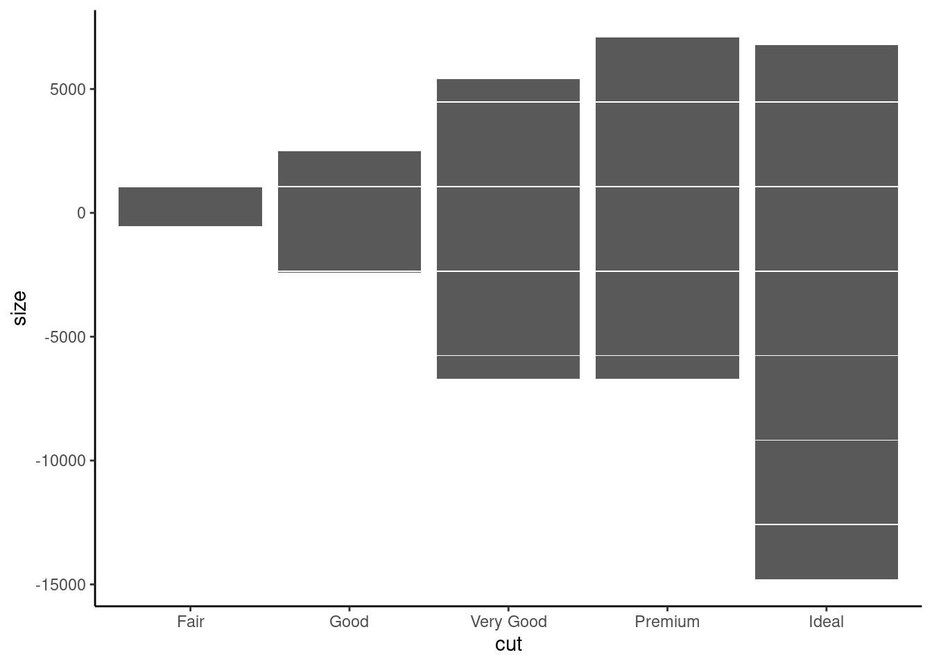
8.2 Rank Plot
8.2.1 Midwest county population rank
We use build-in ggplot data set midwest to demonstrate a rank plot
library(kableExtra)
midwest %>%
  head(10) %>%
  knitr::kable() %>%
   kable_styling("striped", full_width = F) %>%
scroll_box(width = "500px", height = "200px")| PID | county | state | area | poptotal | popdensity | popwhite | popblack | popamerindian | popasian | popother | percwhite | percblack | percamerindan | percasian | percother | popadults | perchsd | percollege | percprof | poppovertyknown | percpovertyknown | percbelowpoverty | percchildbelowpovert | percadultpoverty | percelderlypoverty | inmetro | category |
|---|---|---|---|---|---|---|---|---|---|---|---|---|---|---|---|---|---|---|---|---|---|---|---|---|---|---|---|
| 561 | ADAMS | IL | 0.052 | 66090 | 1270.9615 | 63917 | 1702 | 98 | 249 | 124 | 96.71206 | 2.5752761 | 0.1482826 | 0.3767590 | 0.1876229 | 43298 | 75.10740 | 19.63139 | 4.355859 | 63628 | 96.27478 | 13.151443 | 18.01172 | 11.009776 | 12.443812 | 0 | AAR |
| 562 | ALEXANDER | IL | 0.014 | 10626 | 759.0000 | 7054 | 3496 | 19 | 48 | 9 | 66.38434 | 32.9004329 | 0.1788067 | 0.4517222 | 0.0846979 | 6724 | 59.72635 | 11.24331 | 2.870315 | 10529 | 99.08714 | 32.244278 | 45.82651 | 27.385647 | 25.228976 | 0 | LHR |
| 563 | BOND | IL | 0.022 | 14991 | 681.4091 | 14477 | 429 | 35 | 16 | 34 | 96.57128 | 2.8617170 | 0.2334734 | 0.1067307 | 0.2268028 | 9669 | 69.33499 | 17.03382 | 4.488572 | 14235 | 94.95697 | 12.068844 | 14.03606 | 10.852090 | 12.697410 | 0 | AAR |
| 564 | BOONE | IL | 0.017 | 30806 | 1812.1176 | 29344 | 127 | 46 | 150 | 1139 | 95.25417 | 0.4122574 | 0.1493216 | 0.4869181 | 3.6973317 | 19272 | 75.47219 | 17.27895 | 4.197800 | 30337 | 98.47757 | 7.209019 | 11.17954 | 5.536013 | 6.217047 | 1 | ALU |
| 565 | BROWN | IL | 0.018 | 5836 | 324.2222 | 5264 | 547 | 14 | 5 | 6 | 90.19877 | 9.3728581 | 0.2398903 | 0.0856751 | 0.1028101 | 3979 | 68.86152 | 14.47600 | 3.367680 | 4815 | 82.50514 | 13.520249 | 13.02289 | 11.143211 | 19.200000 | 0 | AAR |
| 566 | BUREAU | IL | 0.050 | 35688 | 713.7600 | 35157 | 50 | 65 | 195 | 221 | 98.51210 | 0.1401031 | 0.1821340 | 0.5464022 | 0.6192558 | 23444 | 76.62941 | 18.90462 | 3.275892 | 35107 | 98.37200 | 10.399635 | 14.15882 | 8.179287 | 11.008586 | 0 | AAR |
| 567 | CALHOUN | IL | 0.017 | 5322 | 313.0588 | 5298 | 1 | 8 | 15 | 0 | 99.54904 | 0.0187899 | 0.1503194 | 0.2818489 | 0.0000000 | 3583 | 62.82445 | 11.91739 | 3.209601 | 5241 | 98.47802 | 15.149781 | 13.78776 | 12.932331 | 21.085271 | 0 | LAR |
| 568 | CARROLL | IL | 0.027 | 16805 | 622.4074 | 16519 | 111 | 30 | 61 | 84 | 98.29813 | 0.6605177 | 0.1785183 | 0.3629872 | 0.4998512 | 11323 | 75.95160 | 16.19712 | 3.055727 | 16455 | 97.91729 | 11.710726 | 17.22546 | 10.027037 | 9.525052 | 0 | AAR |
| 569 | CASS | IL | 0.024 | 13437 | 559.8750 | 13384 | 16 | 8 | 23 | 6 | 99.60557 | 0.1190742 | 0.0595371 | 0.1711692 | 0.0446528 | 8825 | 72.27195 | 14.10765 | 3.206799 | 13081 | 97.35060 | 13.875086 | 17.99478 | 11.914343 | 13.660180 | 0 | AAR |
| 570 | CHAMPAIGN | IL | 0.058 | 173025 | 2983.1897 | 146506 | 16559 | 331 | 8033 | 1596 | 84.67331 | 9.5702933 | 0.1913018 | 4.6426817 | 0.9224101 | 95971 | 87.49935 | 41.29581 | 17.757448 | 154934 | 89.54429 | 15.572437 | 14.13223 | 17.562728 | 8.105017 | 1 | HAU |
In this plot, we highlight the county with top 1% rank of the total population.
- add rank column for total population where county with most population is rank first
- add color column to highlight the top 1% rank of the total population
- use both columns along with poptotal in ggplot
library(ggrepel)
s <-10
mw <- midwest %>% mutate(pop_rank=dense_rank(poptotal) %>%dplyr::desc(.),
                         label=if_else( quantile(pop_rank,0.01) > pop_rank,county, NA),
                         Color=if_else( quantile(pop_rank,0.01) > pop_rank,"NEPC",NA))

ggplot(data = mw, mapping = aes(x = pop_rank, y = poptotal, label = label)) +
  geom_point(show.legend = F, size = 0.5) +
  geom_line(show.legend = F) +
  geom_text_repel(show.legend = F,
                  data = mw,
                  aes(color = Color),
                  direction    = "y",
                  segment.size = 0.2,
                  nudge_x = -nrow(mw)/2,
                  hjust = 0.5,
                  size = 5) +
  theme(text = element_text(size = s),
        axis.title = element_text(size = s),
        axis.text.y = element_text(size = s),
        axis.text.x = element_blank(),
        axis.ticks.x = element_blank(),
        plot.background = element_blank(),
        panel.background = element_blank(),
        panel.border = element_rect(colour = 'black', fill = NA),
        panel.grid = element_blank(),
        plot.title = element_text(size = s))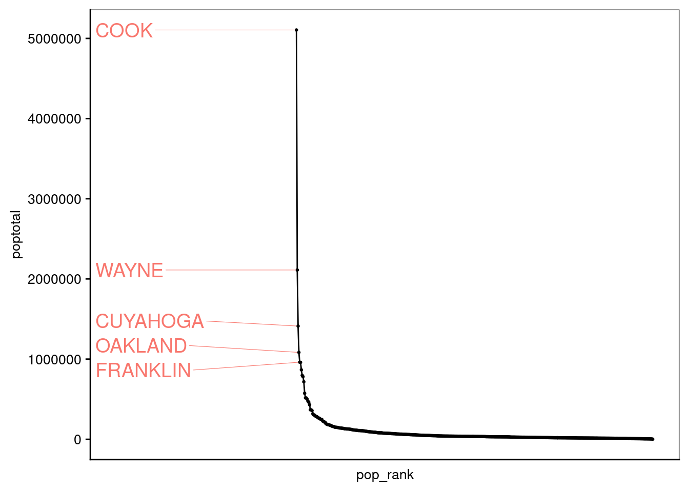
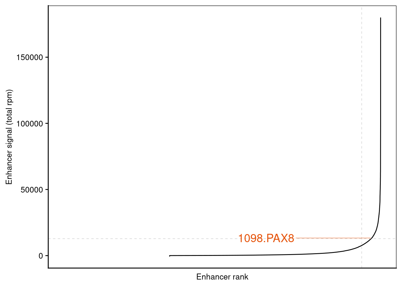
8.2.2 Super-enhancer ranking
We will be using the published super-enhancer tables generated by ROSE2 from this study. tables are downloaded to data folder
table_path <- "data/rose2"
SE_table <- file.path(rprojroot::find_rstudio_root_file(),table_path,"20160213_ClearCell_241_IP_SuperEnhancers_ENHANCER_TO_GENE.ivyAnnotation.txt") %>%
            read_delim(delim = "\t", escape_double = FALSE, trim_ws = TRUE)
AE_table <- file.path(rprojroot::find_rstudio_root_file(),table_path,"20160213_ClearCell_241_IP_AllEnhancers.table.txt") %>%
            read_delim(delim = "\t", escape_double = FALSE, trim_ws = TRUE,comment = "#")
We need to select regions of interest from the super-enhancer(SE) table to highlight in the all enhancer rank plot . The selection column of SE table is subjected to change - this paper use hgnc_symbol column which is not a standard output for ROSE2.
selected_genes <- c('PAX8', 'MUC16')

AE_table <- AE_table %>%
  left_join(SE_table %>% dplyr::select(REGION_ID,hgnc_symbol),by="REGION_ID") %>%
  mutate(label=if_else( hgnc_symbol %in% selected_genes, paste(enhancerRank,hgnc_symbol,sep="."), NA),
         Color=if_else( hgnc_symbol %in% selected_genes,"NEPC",NA),
         enhancer_signal= .[[7]]-.[[8]],
         enhancerRank=  enhancerRank %>% dplyr::desc(.) %>% dense_rank()
         )
AE_table %>%
head(25) %>%
knitr::kable() %>%
kable_styling("striped", full_width = F) %>%
scroll_box(width = "500px", height = "200px")| REGION_ID | CHROM | START | STOP | NUM_LOCI | CONSTITUENT_SIZE | X20160213_ClearCell_241_IP.nodup.bam | X20160213_ClearCell_241_INPUT.nodup.bam | enhancerRank | isSuper | hgnc_symbol | label | Color | enhancer_signal |
|---|---|---|---|---|---|---|---|---|---|---|---|---|---|
| 43_Peak_48006_lociStitched | chr17 | 76242867 | 76418881 | 43 | 113725 | 201060.79 | 21051.274 | 25939 | 1 | SOCS3 | NA | NA | 180009.52 |
| 50_Peak_46808_lociStitched | chr5 | 172141099 | 172382945 | 50 | 111065 | 181287.76 | 27691.367 | 25938 | 1 | ERGIC1 | NA | NA | 153596.39 |
| 60_Peak_67368_lociStitched | chr2 | 43384482 | 43577781 | 60 | 86394 | 121159.81 | 22673.973 | 25937 | 1 | ZFP36L2 | NA | NA | 98485.84 |
| 46_Peak_35499_lociStitched | chr14 | 61928783 | 62088898 | 46 | 91736 | 115042.63 | 19085.708 | 25936 | 1 | HIF1A | NA | NA | 95956.92 |
| 33_Peak_33567_lociStitched | chr17 | 57829124 | 57936837 | 33 | 76168 | 106474.30 | 11913.058 | 25935 | 1 | NA | NA | NA | 94561.24 |
| 55_Peak_12885_lociStitched | chr2 | 102621348 | 102799087 | 55 | 95149 | 111691.19 | 19355.777 | 25934 | 1 | IL1R1 | NA | NA | 92335.41 |
| 36_Peak_129968_lociStitched | chr1 | 234976986 | 235153897 | 36 | 73487 | 110781.67 | 21494.686 | 25933 | 1 | NA | NA | NA | 89286.98 |
| 53_Peak_4224_lociStitched | chr17 | 75280416 | 75469980 | 53 | 88785 | 109530.08 | 21856.729 | 25932 | 1 | SEPT9 | NA | NA | 87673.35 |
| 48_Peak_57256_lociStitched | chr1 | 19696970 | 19841706 | 48 | 86393 | 98087.59 | 15790.698 | 25931 | 1 | CAPZB | NA | NA | 82296.89 |
| 7_Peak_74688_lociStitched | chr11 | 65237939 | 65289520 | 7 | 35765 | 86475.55 | 5973.080 | 25930 | 1 | MALAT1 | NA | NA | 80502.47 |
| 41_Peak_44217_lociStitched | chr17 | 38576036 | 38718176 | 41 | 76899 | 91552.37 | 15450.618 | 25929 | 1 | IGFBP4 | NA | NA | 76101.76 |
| 33_Peak_54260_lociStitched | chr20 | 45932097 | 46021775 | 33 | 51787 | 80001.74 | 10537.165 | 25928 | 1 | ZMYND8 | NA | NA | 69464.58 |
| 83_Peak_23408_lociStitched | chr13 | 110834272 | 111074062 | 83 | 84014 | 93110.46 | 27479.934 | 25927 | 1 | COL4A1 | NA | NA | 65630.52 |
| 33_Peak_67007_lociStitched | chr10 | 80806786 | 80920841 | 33 | 59554 | 78481.25 | 13218.975 | 25926 | 1 | ZMIZ1 | NA | NA | 65262.27 |
| 22_Peak_8570_lociStitched | chr20 | 48862888 | 48970477 | 22 | 60020 | 76614.13 | 13211.929 | 25925 | 1 | LINC01270 | NA | NA | 63402.20 |
| 15_Peak_57019_lociStitched | chr20 | 30248708 | 30311816 | 15 | 55280 | 70933.39 | 7945.297 | 25924 | 1 | BCL2L1 | NA | NA | 62988.09 |
| 12_Peak_57622_lociStitched | chr9 | 132199256 | 132265465 | 12 | 32463 | 69751.18 | 6865.873 | 25923 | 1 | LINC00963 | NA | NA | 62885.31 |
| 40_Peak_134029_lociStitched | chr2 | 145169229 | 145284831 | 40 | 52403 | 75095.06 | 12265.372 | 25922 | 1 | ZEB2 | NA | NA | 62829.69 |
| 28_Peak_22245_lociStitched | chr10 | 95166368 | 95242555 | 28 | 56779 | 71501.50 | 8974.829 | 25921 | 1 | MYOF | NA | NA | 62526.67 |
| 41_Peak_17862_lociStitched | chr14 | 70046476 | 70195808 | 41 | 74036 | 79280.36 | 17247.846 | 25920 | 1 | SUSD6 | NA | NA | 62032.51 |
| 6_Peak_107794_lociStitched | chr19 | 12867589 | 12907618 | 6 | 19688 | 63802.22 | 4399.187 | 25919 | 1 | HOOK2 | NA | NA | 59403.04 |
| 18_Peak_61548_lociStitched | chr11 | 118740246 | 118805235 | 18 | 34657 | 66087.31 | 6713.364 | 25918 | 1 | BCL9L | NA | NA | 59373.95 |
| 16_Peak_16126_lociStitched | chr14 | 69223061 | 69292491 | 16 | 33746 | 67006.89 | 8130.253 | 25917 | 1 | ZFP36L1 | NA | NA | 58876.64 |
| 27_Peak_59747_lociStitched | chr14 | 75688546 | 75778543 | 27 | 41435 | 69594.68 | 10835.639 | 25916 | 1 | FOS | NA | NA | 58759.04 |
| 17_Peak_15694_lociStitched | chr22 | 36716764 | 36787903 | 17 | 54293 | 66842.20 | 8209.441 | 25915 | 1 | MYH9 | NA | NA | 58632.76 |
setting cutoff for both x and y axis for ranking plot
signal_cutoff <- AE_table %>% filter(isSuper==0) %>% dplyr::select(enhancer_signal) %>% max %>% unlist()
non_se_total <- AE_table %>% group_by(isSuper) %>% summarise(n=n())  %>% dplyr::select(n) %>% unlist %>% diff %>% abs
s <- 10
ggplot(data = AE_table, mapping = aes(x = enhancerRank, y = enhancer_signal, label = label)) +
    geom_line(show.legend = F) +
    xlab(label = 'Enhancer rank') +
    ylab(label = 'Enhancer signal (total rpm)') +
    geom_hline(yintercept = signal_cutoff, linetype = 2, col = 'grey', size = 0.2) +
    geom_vline(xintercept = non_se_total, linetype = 2, col = 'grey', size = 0.2) +
    geom_text_repel(show.legend = F,
                    data = AE_table,
                    aes(color = Color),
                    direction    = "y",
                    segment.size = 0.2,
                    nudge_x = -nrow(AE_table)/2,
                    hjust = 0.5,
                    size = 5) +
    scale_color_manual(values=c("black" = "grey", "NEPC" = "#e6550d", "PRAD" = "#3182BD", "COM" = "black" )) +
    theme(text = element_text(size = s),
          axis.title = element_text(size = s),
          axis.text.y = element_text(size = s),
          axis.text.x = element_blank(),
          axis.ticks.x = element_blank(),
          plot.background = element_blank(),
          panel.background = element_blank(),
          panel.border = element_rect(colour = 'black', fill = NA),
          panel.grid = element_blank(),
          plot.title = element_text(size = s))
## Warning: Removed 25938 rows containing missing values or values outside the scale range (`geom_text_repel()`).