10 Decorate figures with minimal hassle
Since your paper is only as good as your figures
We will be using the build-in ggplot data set economics.
| date | pce | pop | psavert | uempmed | unemploy |
|---|---|---|---|---|---|
| 1967-07-01 | 506.7 | 198712 | 12.6 | 4.5 | 2944 |
| 1967-08-01 | 509.8 | 198911 | 12.6 | 4.7 | 2945 |
| 1967-09-01 | 515.6 | 199113 | 11.9 | 4.6 | 2958 |
| 1967-10-01 | 512.2 | 199311 | 12.9 | 4.9 | 3143 |
| 1967-11-01 | 517.4 | 199498 | 12.8 | 4.7 | 3066 |
| 1967-12-01 | 525.1 | 199657 | 11.8 | 4.8 | 3018 |
| 1968-01-01 | 530.9 | 199808 | 11.7 | 5.1 | 2878 |
| 1968-02-01 | 533.6 | 199920 | 12.3 | 4.5 | 3001 |
| 1968-03-01 | 544.3 | 200056 | 11.7 | 4.1 | 2877 |
| 1968-04-01 | 544.0 | 200208 | 12.3 | 4.6 | 2709 |
10.1 Cowplot
The cowplot package is a simple add-on to ggplot. It provides various features that help with creating publication-quality figures, such as a set of themes, functions to align plots and arrange them into complex compound figures, and functions that make it easy to annotate plots and or mix plots with images.
10.1.2 Themes
Cowplot can be used to create sleek and cohesive themes among your figures. These themes can be adjusted to best suit the needs of your graphs.

You can also initialize the cowplot theme at the top of your markdown.
theme_set(theme_cowplot())
ggplot(economics, aes(x= pce, y= pop, fill= unemploy)) +
  geom_point(size = 0.5)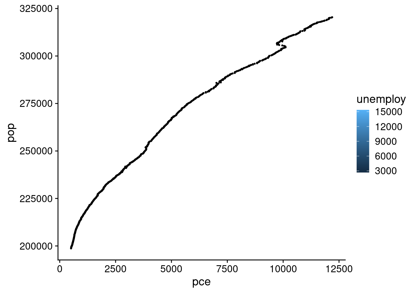
10.1.3 Arranging Plots
Cowplot is especially useful in its ability to organize and label multiple figures in a grid.
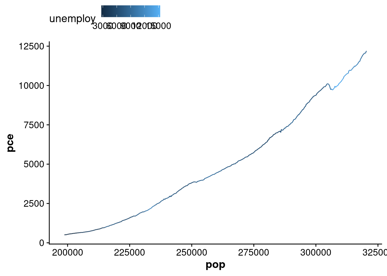
plotA <- ggplot(economics, aes(x= pce, y= pop, fill= unemploy)) +
  geom_point(size = 0.5)
plotB <- ggplot(economics, aes(x= pop, fill= pce)) +
  geom_bar()

plot_grid(plotA, plotB, labels = c("A", "B"), label_size = 12)
## Warning: The following aesthetics were dropped during statistical transformation: fill.
## ℹ This can happen when ggplot fails to infer the correct grouping structure in the data.
## ℹ Did you forget to specify a `group` aesthetic or to convert a numerical variable into a factor?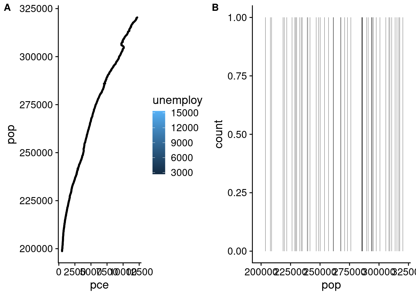
White space can be incorporated into the grid through the addition of a NULL. The relative heights and widths of each graph can also be adjusted
plotA <- ggplot(economics, aes(x= pce, y= pop, fill= unemploy)) +
  geom_point(size = 0.5)
plotB <- ggplot(economics, aes(x= pop, fill= pce)) +
  geom_bar()

plot_grid(plotA, plotB, NULL, labels = c("A", "B"), label_size = 12, rel_heights = c(1, 2, 0.5), rel_widths = c(2, 2, 0.5))
## Warning: The following aesthetics were dropped during statistical transformation: fill.
## ℹ This can happen when ggplot fails to infer the correct grouping structure in the data.
## ℹ Did you forget to specify a `group` aesthetic or to convert a numerical variable into a factor?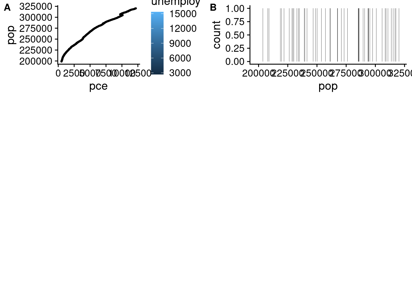
The number of columns and rows in the grid can be specified as well.
plotA <- ggplot(economics, aes(x= pce, y= pop, fill= unemploy)) +
  geom_point(size = 0.5)
plotB <- ggplot(economics, aes(x= pop, fill= pce)) +
  geom_bar()

plot_grid(plotA, plotB, labels = c("A", "B"), label_size = 12, ncol = 3, nrow = 2)
## Warning: The following aesthetics were dropped during statistical transformation: fill.
## ℹ This can happen when ggplot fails to infer the correct grouping structure in the data.
## ℹ Did you forget to specify a `group` aesthetic or to convert a numerical variable into a factor?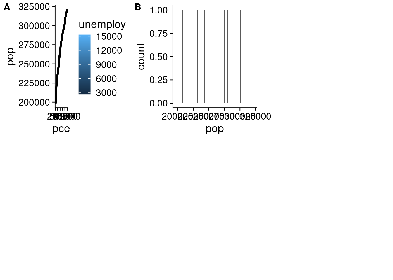
10.1.4 Stacking Plots
Cowplots can be merged within the plot_grid() function.
plotA <- ggplot(economics, aes(x= pce, y= pop, fill= unemploy)) +
  geom_point(size = 0.5)
plotB <- ggplot(economics, aes(x= pop, fill= pce)) +
  geom_bar()
plotC <- ggplot(economics, aes(x= pop, y= unemploy, fill= psavert)) +
  geom_point(size = 0.5)

top_plots <- plot_grid(plotA, plotB, labels = c("A", "B"), label_size = 12, ncol = 2)
## Warning: The following aesthetics were dropped during statistical transformation: fill.
## ℹ This can happen when ggplot fails to infer the correct grouping structure in the data.
## ℹ Did you forget to specify a `group` aesthetic or to convert a numerical variable into a factor?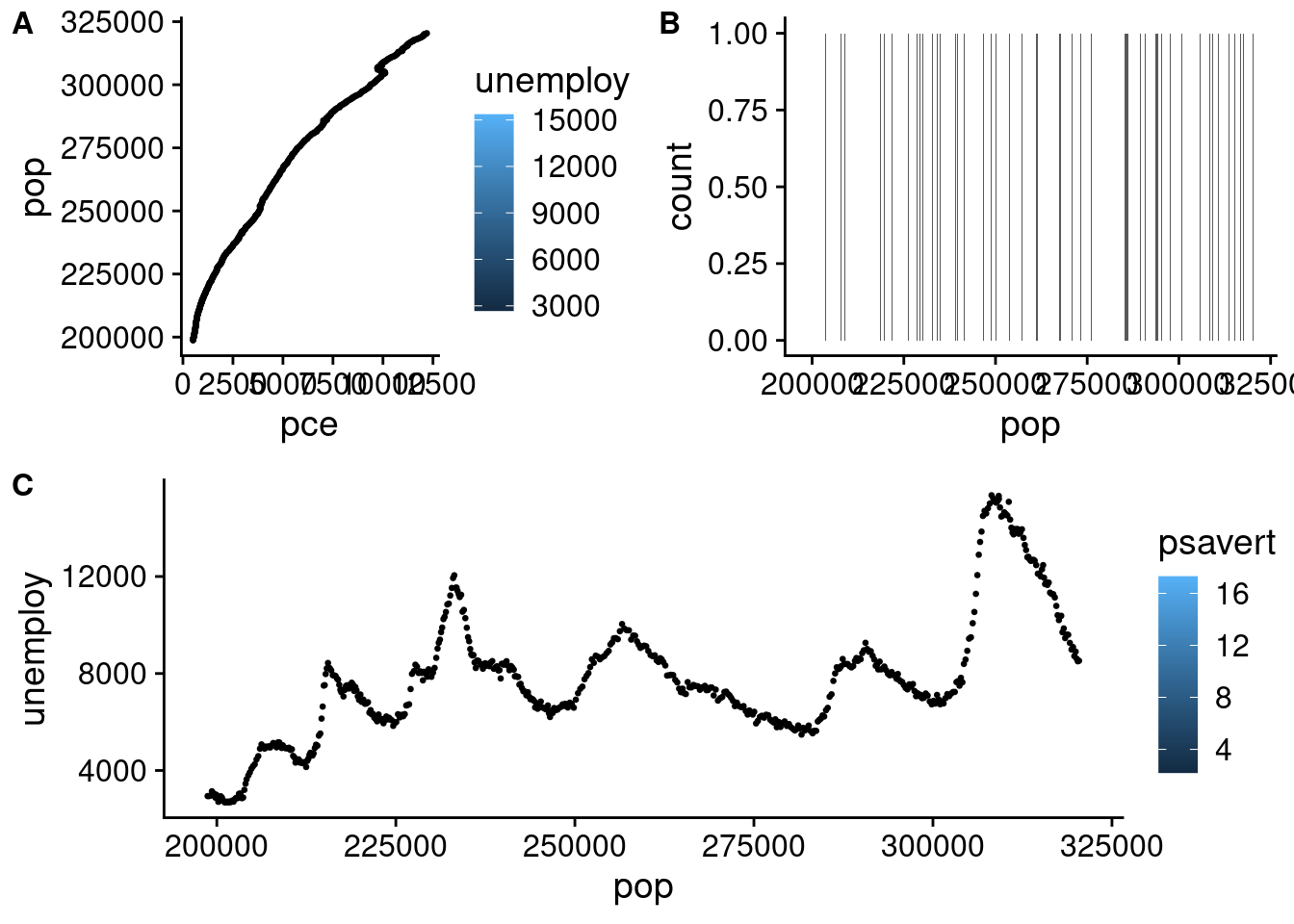
10.1.5 Plotting an Upset Plot
To plot an upset plot within cowplot, a few alterations must be made to the inputted values. Since UpsetR is not related to ggplot, it is not in a format ggplot/cowplot can interpret. To simplify matters, we have provided a function.
convert_upset_cowplot <- function(plot){
  cowplot::plot_grid(NULL, plot$Main_bar, plot$Sizes, plot$Matrix,
                     nrow=2, align='hv', rel_heights = c(3,1),
                     rel_widths = c(2,3))
}
upsetEconomics <- as.data.frame(economics) %>%
            mutate(
                pce_long= if_else( pce >= median(pce),1,0),
                pop_long= if_else( pop >= median(pop),1,0)) %>%
            dplyr::select(pce_long,pop_long) %>%
            upset(.,empty.intersections = TRUE)

convert_upset_cowplot(upsetEconomics)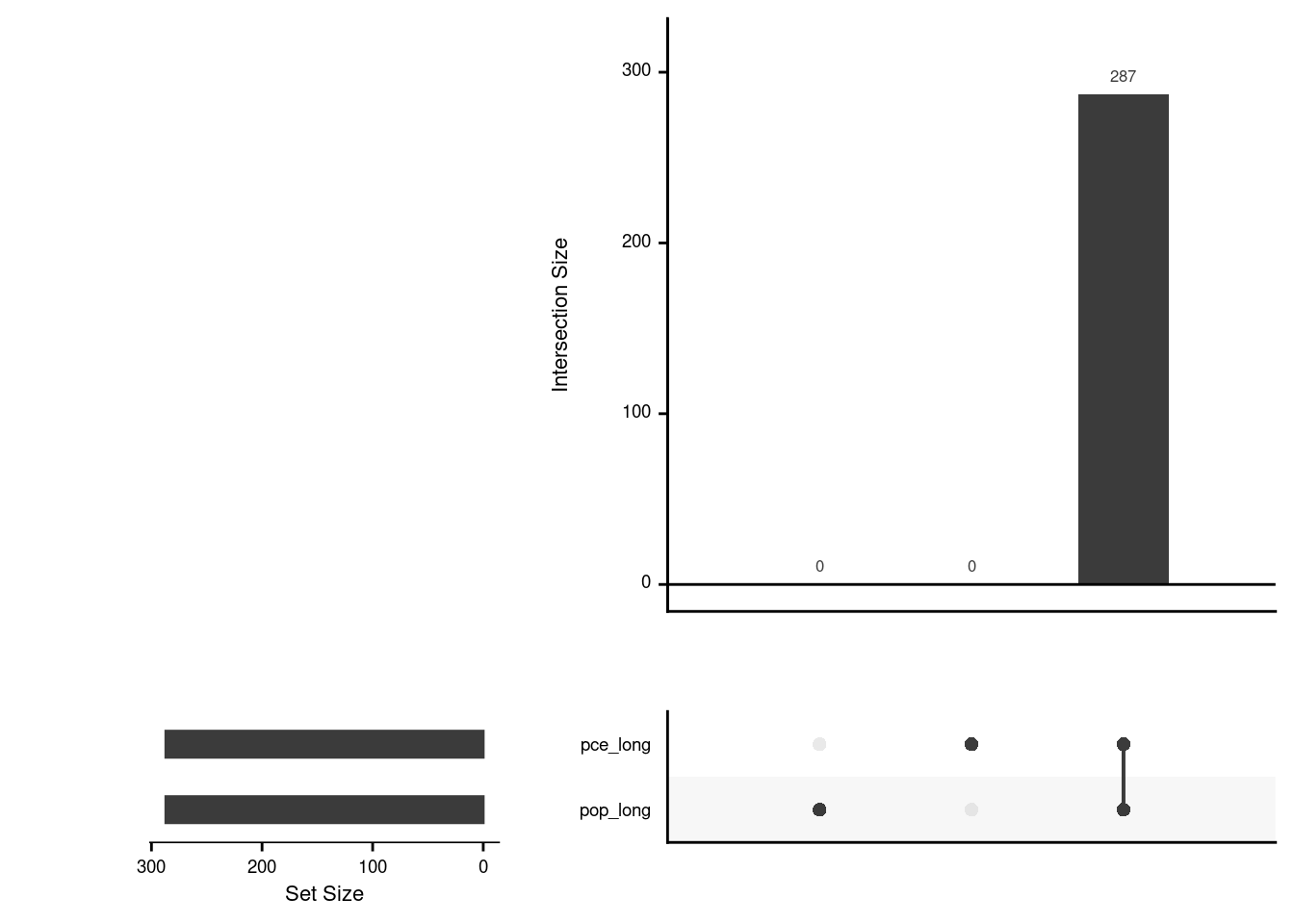
10.2 Using Facet_Wrap
facet_wrap is a function within ggplot that allows you to organize your graphs based on specific variables. This function allows you to specify the number of graphs per row and column, as well.
ggplot(diamonds, aes(x= depth, y= price)) +
  geom_point() +
facet_wrap(vars(cut), nrow = 3, ncol = 2) 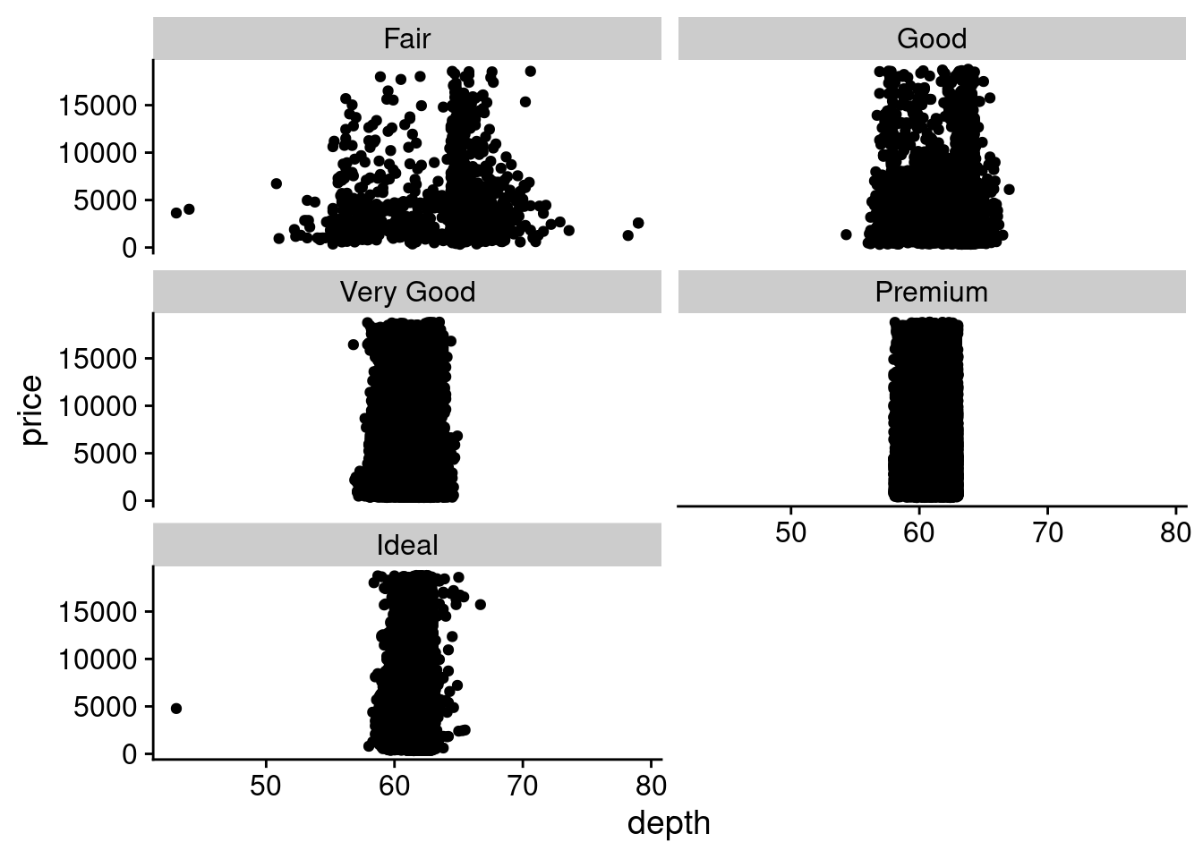
The graphs can also have different axises.
ggplot(diamonds, aes(x= depth, y= price)) +
  geom_point() +
facet_wrap(vars(cut), nrow = 3, ncol = 2, scales = "free") 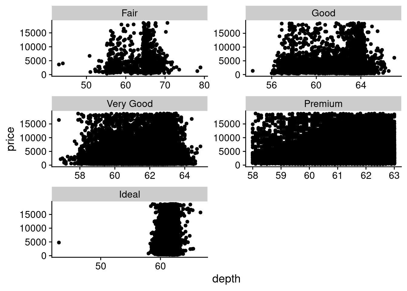
10.3 Scales and Labels
We will be using the build-in ggplot data set economics.
| date | pce | pop | psavert | uempmed | unemploy |
|---|---|---|---|---|---|
| 1967-07-01 | 506.7 | 198712 | 12.6 | 4.5 | 2944 |
| 1967-08-01 | 509.8 | 198911 | 12.6 | 4.7 | 2945 |
| 1967-09-01 | 515.6 | 199113 | 11.9 | 4.6 | 2958 |
| 1967-10-01 | 512.2 | 199311 | 12.9 | 4.9 | 3143 |
| 1967-11-01 | 517.4 | 199498 | 12.8 | 4.7 | 3066 |
| 1967-12-01 | 525.1 | 199657 | 11.8 | 4.8 | 3018 |
| 1968-01-01 | 530.9 | 199808 | 11.7 | 5.1 | 2878 |
| 1968-02-01 | 533.6 | 199920 | 12.3 | 4.5 | 3001 |
| 1968-03-01 | 544.3 | 200056 | 11.7 | 4.1 | 2877 |
| 1968-04-01 | 544.0 | 200208 | 12.3 | 4.6 | 2709 |
10.3.1 Axis Labels
Within ggplot, there are ways of manipulating your axis labels to ensure maximal clarity.
For example, scales manage how data is mapped to visual elements like position, color, or size. You can adjust the default scales to fine-tune things like axis labels, legend keys, or even how the data is visually represented. Functions like labs() and lims() offer quick ways to modify labels or set limits for your plot.
10.3.1.1 Rotation
Rotating axis labels is a quick solution which can make your x-axis more legible, especially if your labels are lengthy.
ggplot(economics, aes(x= pop, y= pce)) +
  geom_point() +
  guides(x = guide_axis(angle = 45)) +
  theme_minimal()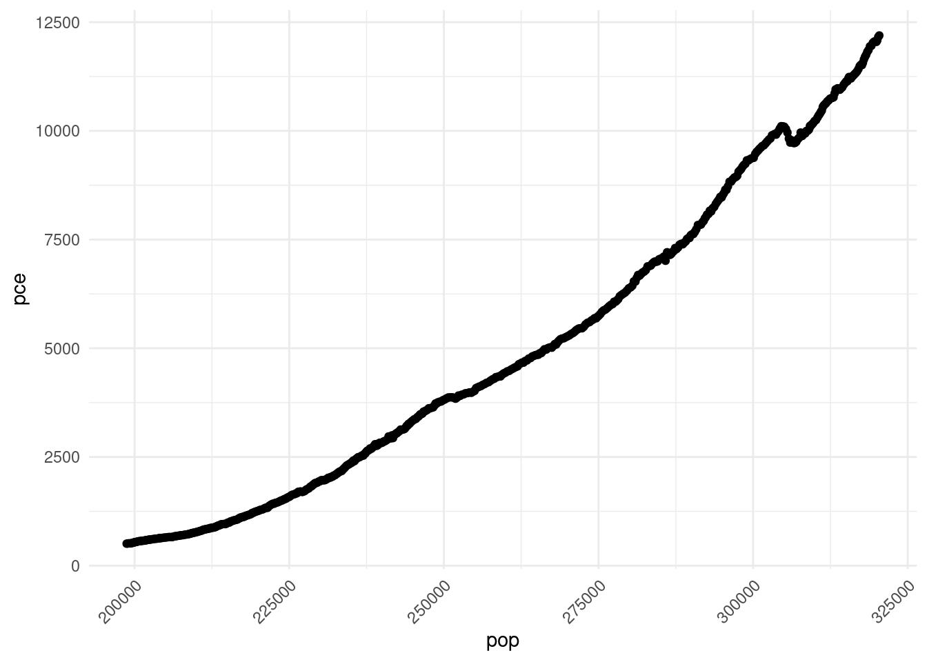
10.3.1.2 Color
#Later additions will be favored
ggplot(economics, aes(x= pop, y= pce)) +
  geom_point() +
  theme_minimal() +
  theme(axis.line = element_line(colour = "black"),
        axis.text = element_text(color="black"))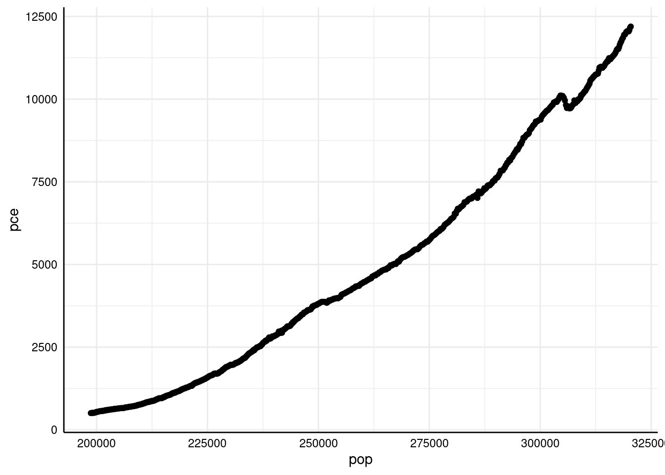
10.3.1.3 Other modtificaitno using theme
The theme() function allows you to modify the appearance of non-data elements in a plot, providing extensive control over elements like text, titles, axis lines, background color, gridlines, legend positioning, and more.
ggplot(economics, aes(x = pop, y = pce,color=unemploy)) +
    geom_line() +
    theme(
        panel.background = element_rect(fill = "white"),
        panel.grid.major = element_blank(),
        panel.grid.minor = element_blank(),
        legend.position = "top",
        axis.title = element_text(size = 14, face = "bold"),
        axis.text = element_text(size = 12)
    )
10.3.3 Log scale transformation
Log scale transformation in ggplot2 compresses high values, expands low ones, and de-emphasizes outliers, improving the visibility of skewed data.
ggplot(economics, aes(x= pop, y= pce)) +
  geom_point() +
  theme_minimal() +
  scale_y_log10() +
  scale_x_continuous(trans="log10") # same as scale_x_log10()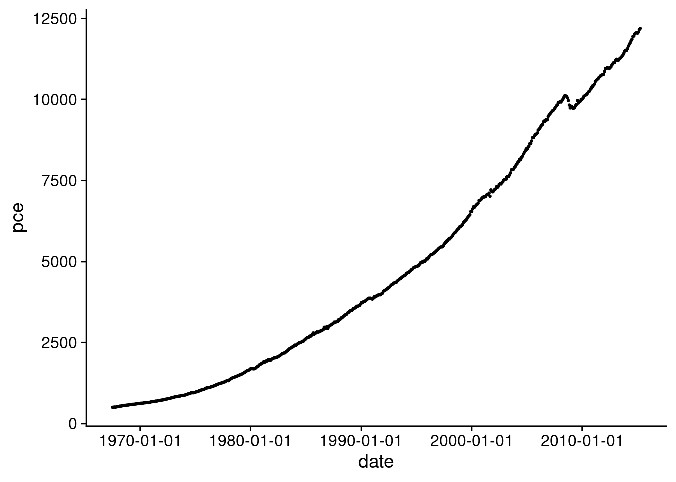
10.3.4 Customized scale
Custom Breaks: You can specify where the ticks should appear on the axis
Labels and Title: You can add custom labels and a title for the x-axis:
scale_y_continuous(name = "An amazingly great y axis label")
lims() can be used as well for labels
Set Limits: You can define the minimum and maximum values
scale_x_continuous(limits = c(1, 7))
ggplot(economics, aes(x= pop, y= pce)) +
  geom_point() +
  theme_minimal() +
  scale_x_continuous(limits = c(2e5, 4e5)) +
  scale_y_continuous(name = "This is a y axis label", breaks=seq(1e3,13e3,2e3))
## Warning: Removed 8 rows containing missing values or values outside the scale range (`geom_point()`).
10.3.5 Dates in the X-Axis
Dates are difficult to incorporate into the x-axis as character vectors, as often they need to be manipulated in ways impossible to manipulate character values. To work around this, they can be incorporated into the x-axis as a Date class, allowing for further maneuvering.
10.3.6 The Date Class
The date class provides a streamlined way to store dates within R itself. Variables of this class require a day, month, and year value to be initialized, and specific values can be extracted to create your desired appearance. It is important to note that the date must be inputted in a way R can understand.
For example -
## [1] "2022-11-30"10.3.7 Example
economics <- economics %>%
            mutate(date = as.Date(date))

ggplot(economics, aes(x = date, y = pce)) +
  geom_point(size = 0.5) +
  scale_x_date(labels = scales::label_date()) +
  theme_minimal()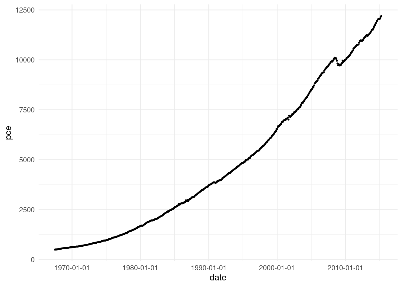
You can also increment the x-axis by a specific time period
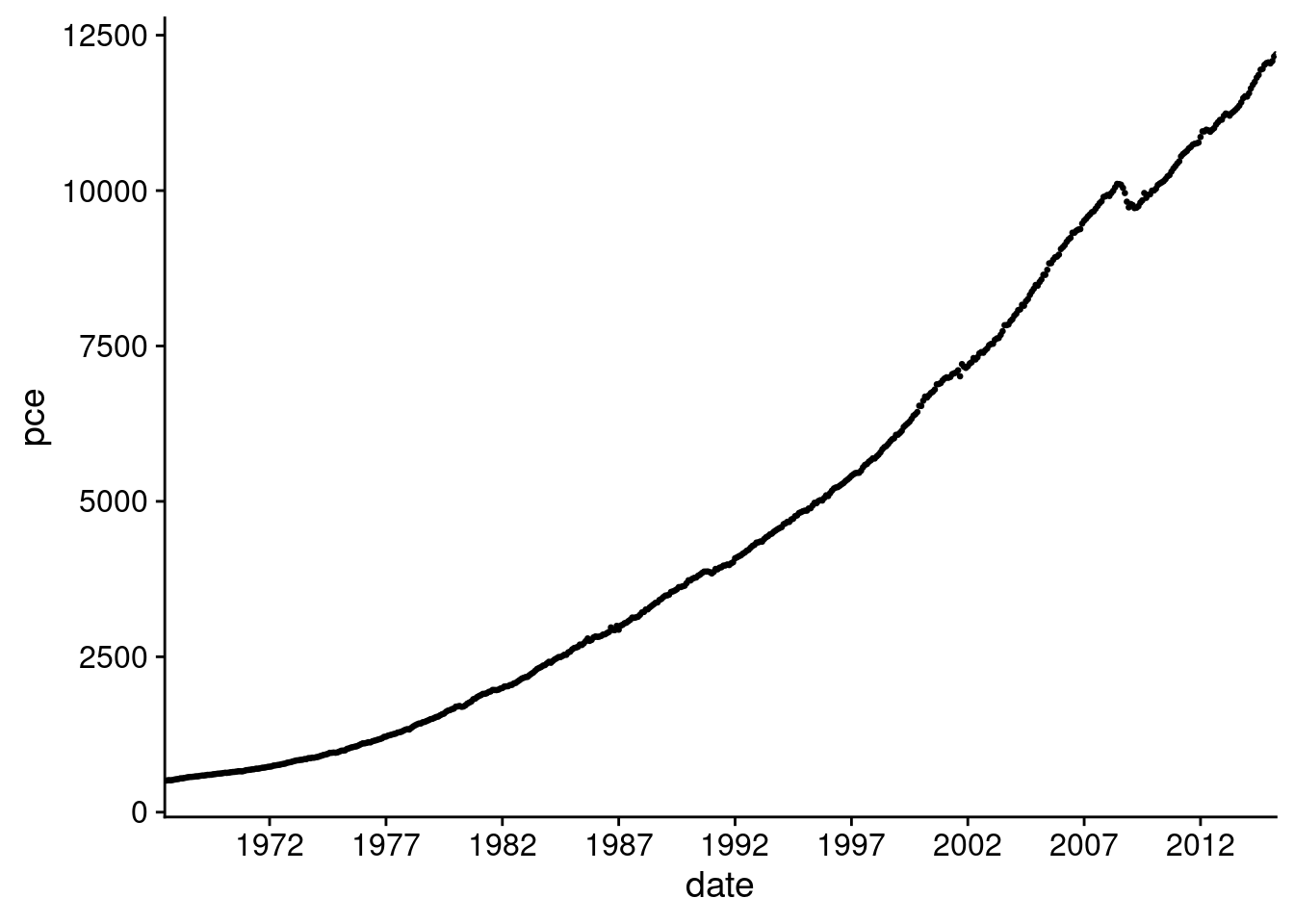
economics <- economics %>% mutate(date = as.Date(date))
ggplot(economics, aes(x = date, y = pce)) +
  geom_point(size = 0.5) +
  scale_x_date(labels = scales::label_date_short(),
               breaks = seq(as.Date("1967-01-01"),
                            as.Date("2015-01-01"),
                            by = '5 years'),
               expand = c(0, 0))